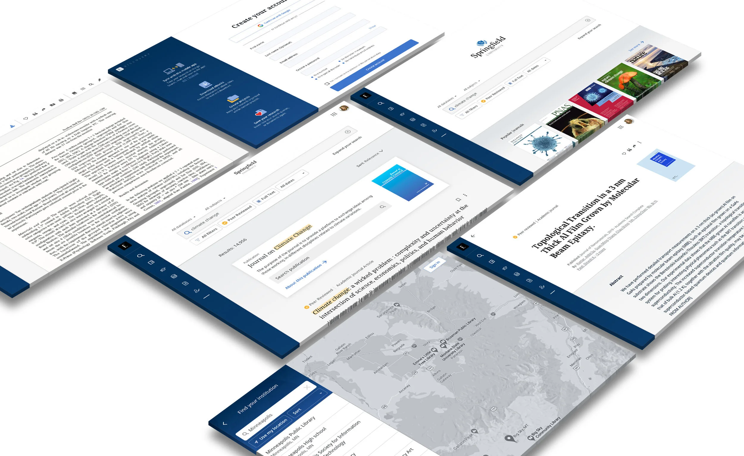
Discovery Platform
Design thinking at the center of a digital transformation.
Our team was asked to shape the design vision for this multi-year, $7 Million+ project. Creating a story around why we needed to reimagine our core product line. Inspiring colleagues to see both business and customer benefits of a new and improved experience…
And along the way, focusing on agile execution and measurement. Our team partnered with development inside our SAFe agile framework.
MY ROLE
Research
Strategy
UX/UI Design
The Challenge
Our flagship products had long passed through the maturity stage. Sales and renewals were in decline. The win-loss analysis highlighted our dated User Interface as a contributing factor.
Our experience had lost appeal.
But change could be difficult, costly, and slow. During years of growth, design and technical debt had piled up.
Business stakeholders asked for a "snap change."
But... through the refinement process, our User Research highlighted the risk in this sudden approach. We knew how immediate and untested changes could jeopardize the $740 Million in associated revenue.
Instead, we educated on how our redesign should be incremental, progressive, and tested. So, we went to work to better understand how people utilize our product(s); learn more about the problems they were facing.
Our redesign began.
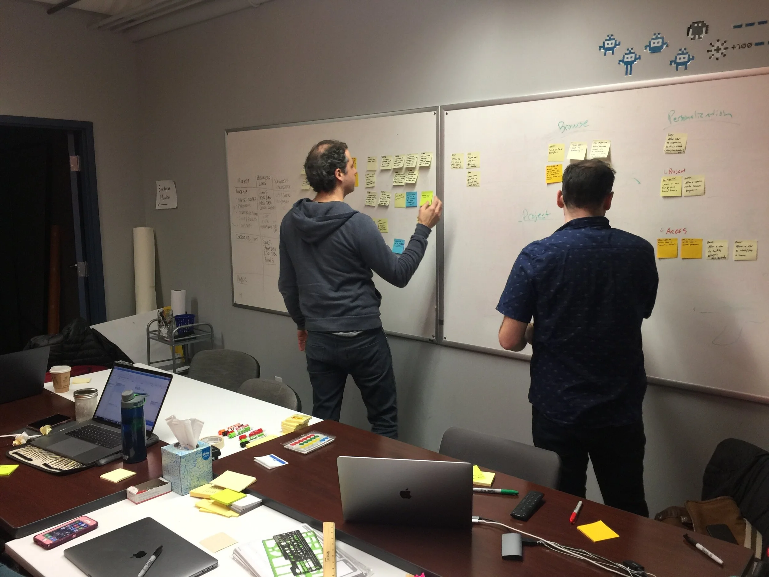
Step 1 - UX Strategy (EPIC)
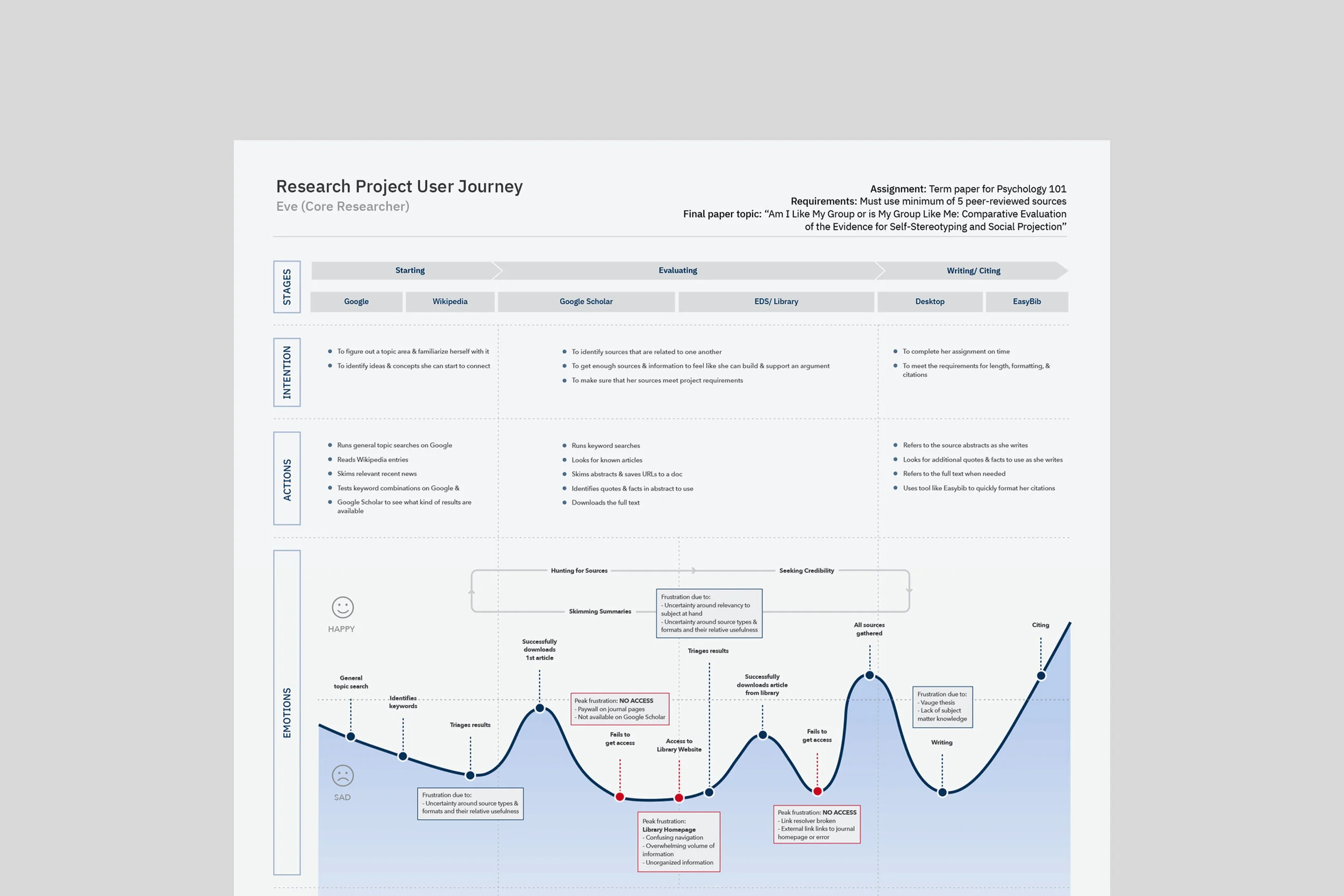
Qualitative User Research - To start, UX team members conducted moderated usability testing using think-aloud protocol intended to...
Identify which parts of current experience work, and what fails
Understand user needs and preferences – what brings happiness
Determine what changes are needed to improve the usability – content hierarchy, navigation, effectiveness, ease of use, satisfaction, etc.
From these findings, we were able to deliver awesome stuff like...
Personas - To build empathy we identified and refined a small group of needs-based personas. Persona attributes (like goals, challenges, etc.) were validated and aligned to larger business strategy.
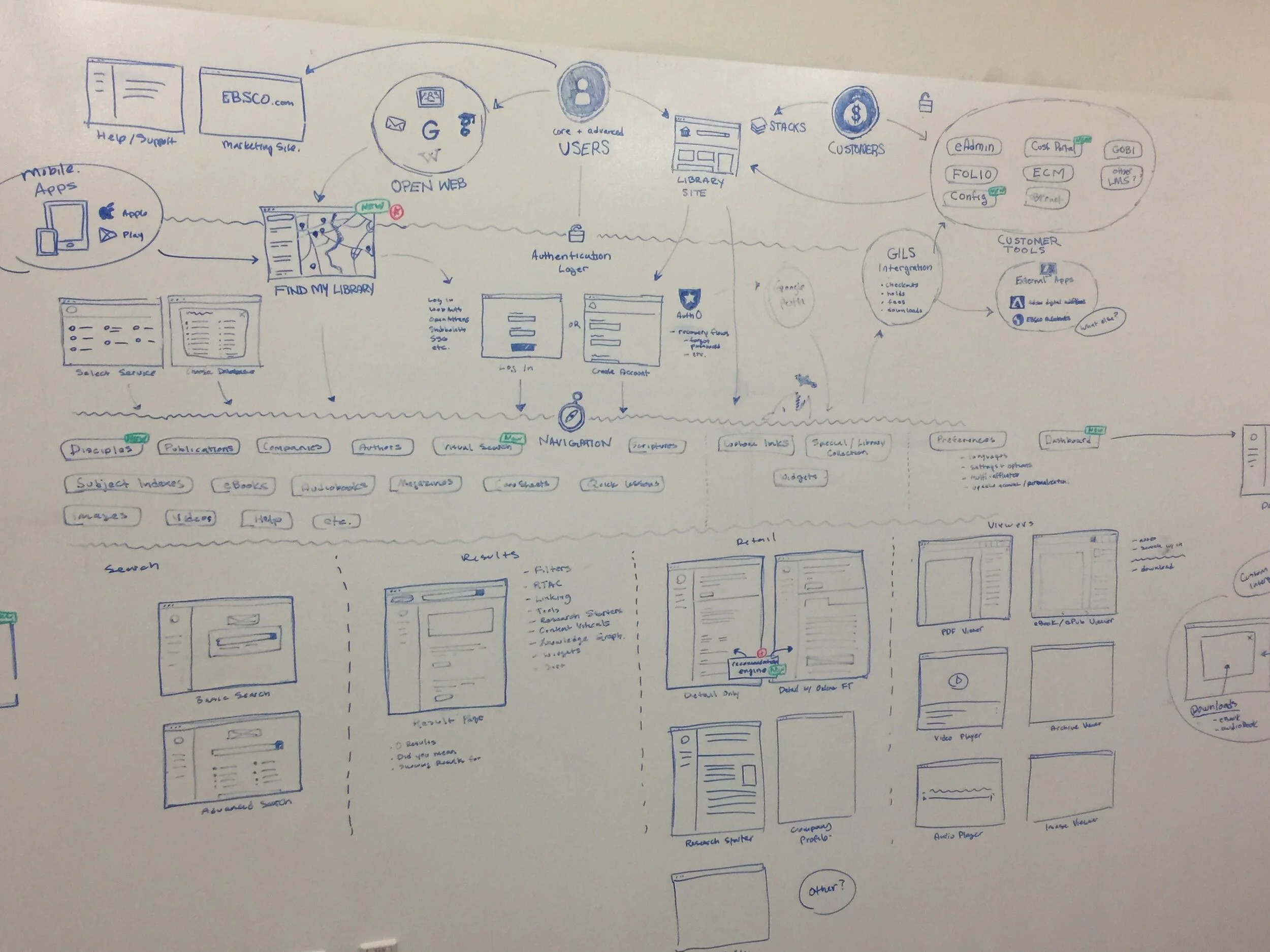
Journey Maps & User flows - UX team created a series of journey maps, site maps and user flows to align the organization on how our personas could come in contact with our design.
North star KPIs - User Research told us that users find value through meaningful interactions with our content. Users were motivated to acquire depth of knowledge (associated with our academic content). Further analysis also showed the importance of utility and performance. We set out to deliver "depth, fast."
Step 2 - Definition (Capabilities)
Our UX Strategy was in place.
Next, the UX team created, and tested, multiple prototypes to mark out the most desirable aspects (measurement). Those exercises informed our product roadmap (MVP) and validated the project's value proposition.
How might we improve...
Access
Make it more seamless to drive personalization and reduce abandonment. UX Focus on eliminating complexity and removing the burden on the user.
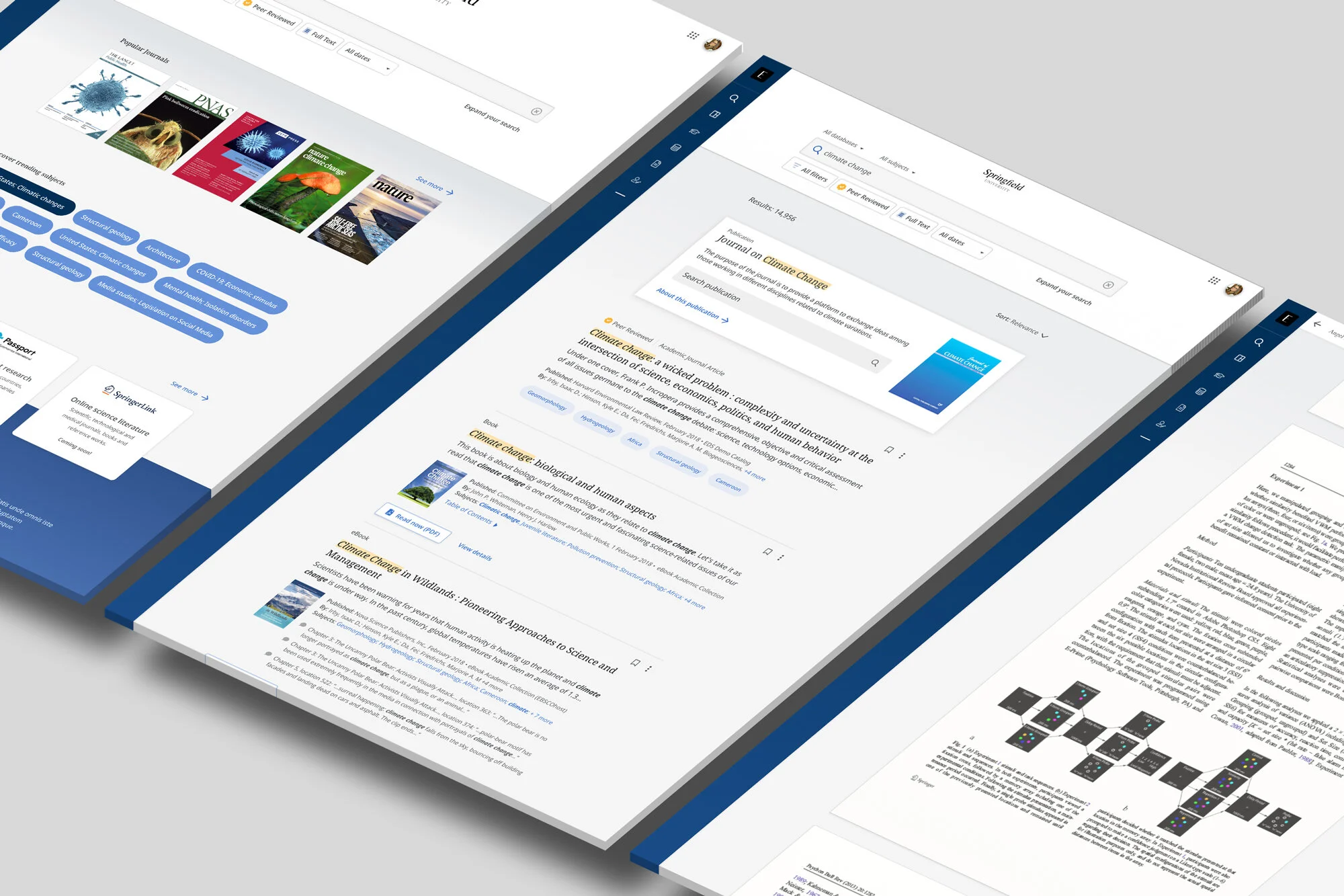
Search
Needs to support both (a)finding known items and (b)learning new, relevant things. Search patterns need to scale and anticipate user needs.
Use
Make sure our tools are effective and task-based. Address the prioritized problems to solve. Aim to fit better into the larger digital ecosystem.
Step 3 - Delivery (Features)
With the UX runway established, we started to introduce both content and constraints. Our goal was to produce "just-in-time" design deliverables to define exactly the UI patterns and components required. Sometimes, to better focus on user outcomes, UX Designers deliver set-based designs or proposals for A/B or multivariate experiments.
We delivered a right-sized and focused path forward.
Outcomes
In the second quarter of 2020, we launched our Discovery Platform in an initial BETA phase. We then set out to drive customer adoption and protect renewal revenue.
Immediately, 7 early adopters went live. An additional 300+ customers stood up preview instances. This provided us an opportunity to collect meaningful quantitative data to coincide with our growing collection of qualitative findings.
Usability.
All scores came in above average with an overall 92 SUS score (across all personas). Our initial design showed to be a success, with an ease-of-use score of 6.6 (out of 7) and a task success rate of 81%.
Beta Complete.
A live environment with 78% of all planned features accepted and business MVP achieved. The Initial Beta phase (Epic) closed out. Moved into the adoption phase with 500+ customer cohorts.
Improved Access.
From 115K page views, 80% of Marketing site traffic accessed products through Find-my-Institution. Of that group, 78% were able to successfully authenticate which led to an uptick in return users (+29%)
Accessibility.
Beta product tested against WCAG 2.1 fulfilling customer RFPs that require compliance. Accessible visuals, screen reader inputs, and gestures all defined by the UX Design team.
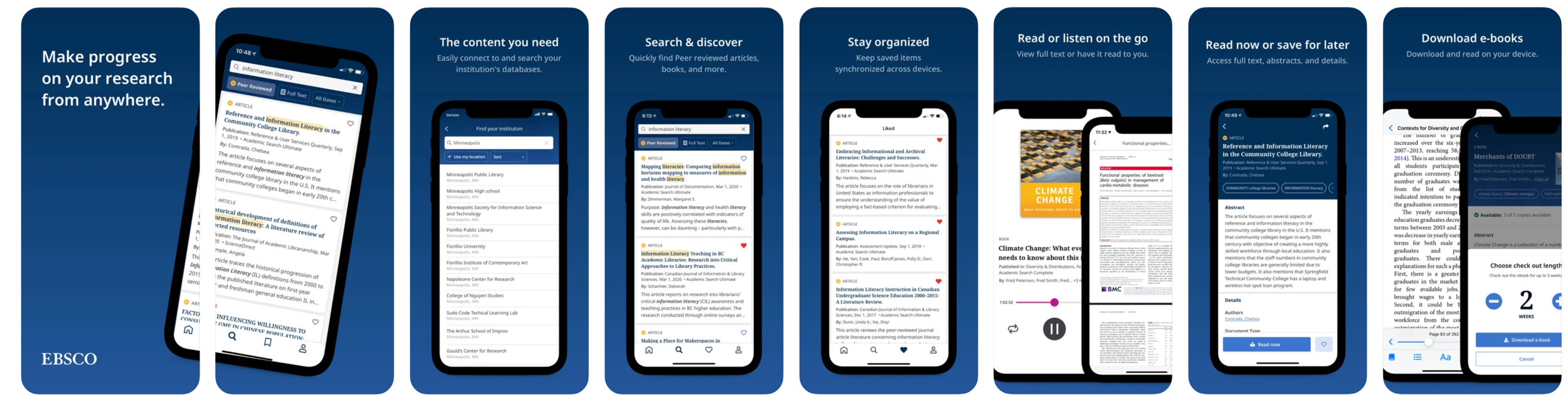
Mobile Apps
Continuous Learning - Learning new things is awesome!
We learned users expected a multi-device and multi-environment solution. This meant brand-new iOS and Android apps, intended to provide further reach for our experience/brand, but also to serve as a test lab for UX experimentation and innovation.
We got a brand new side project.