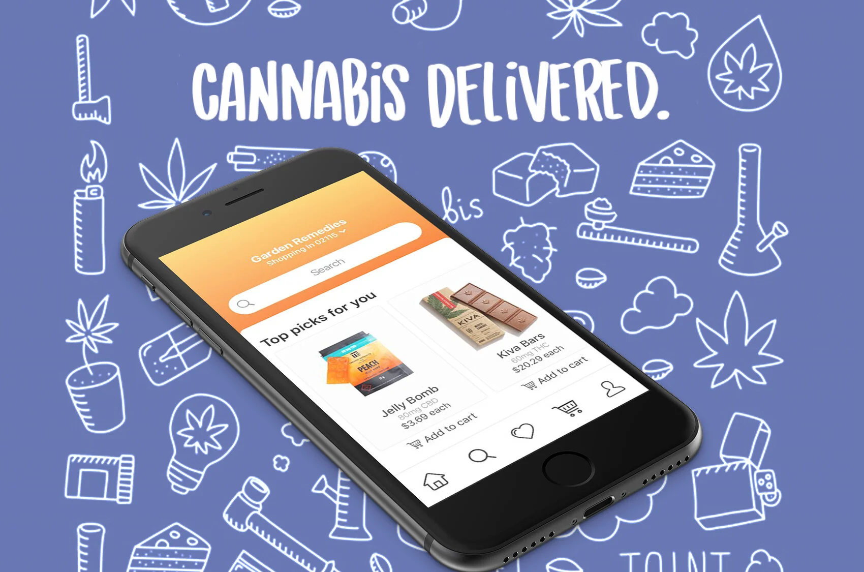
Hello Canna
Reimagining buying and learning about legal cannabis products.
Hello Canna is a mobile application designed to provide safe, legal access to cannabis products via delivery.
This was created as a part of General Assembly's Immersive Design Program, with the objective to come up with an idea to enhance safe access to legal cannabis and educate people about cannabis as a tool for wellness.
MY ROLE
UX/UI Design
Research
Background
The global legal marijuana market size was valued at USD 9.1 billion in 2018 and was expected to expand. One of the major factors fueling the US market growth is the expanding demand for legal marijuana owing to the growing number of legal cannabis countries.
As new legislation begins to allow a growing market opportunity around cannabis, it is increasingly important to provide seamless, transparent, and educational experiences for consumers. My team and I tackled this opportunity.
I was the sole designer on the team alongside 1 business analyst and 1 researcher. I was responsible for the product design and UX/UI experience.
Key achievements:
Applied design sprints to inform our process. We were able to effectively apply the design sprints process to identify the problem, ideate on the solution, and prototype the final product.
Juggled many different hats. I dedicated weeknights and weekends conducting research, sketching, testing, and designing the product alongside coordinating user interviews, writing interview scripts, and creating pitch decks.
Completed the Bootcamp. It's worth noting that the best designs are not a result of the designer on the team. Each person was able to contribute to the solution, which resulted in a very collaborative result.
Understanding the problem
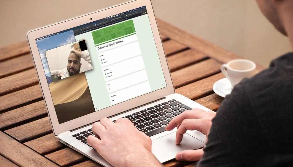
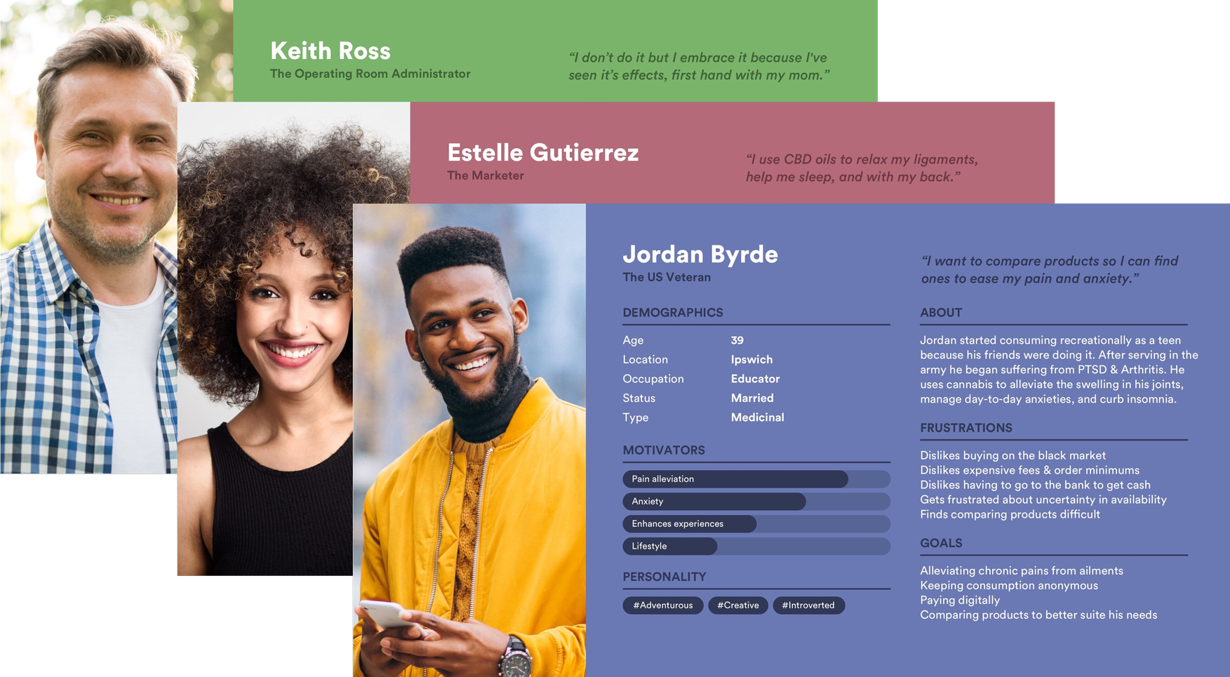
We conducted user interviews to uncover pain points felt by cannabis consumers. Then we created personas to illustrate our users' needs, behaviours and goals.
We interviewed 14 consumers with a variety of experiences using cannabis. Half were recreational, half were medicinal, and our group ranged from 21 to 47 years old. We had a very diverse experience pool. Check out the responses.
It was revealed that:
Consumers were wary about the products they buy on the black market. They’re unsure of where it’s from, what’s in it, and its validity.
Consumers were afraid of exposing their usage. They fear the social stigma and how it may affect them (I.e job loss, jail time).
Consumers would feel more comfortable if the experience matched today’s convenience, personalization, and security (i.e Amazon, Uber Eats, Airbnb).
Product vision and solution
From these findings, we created personas and identified goals.
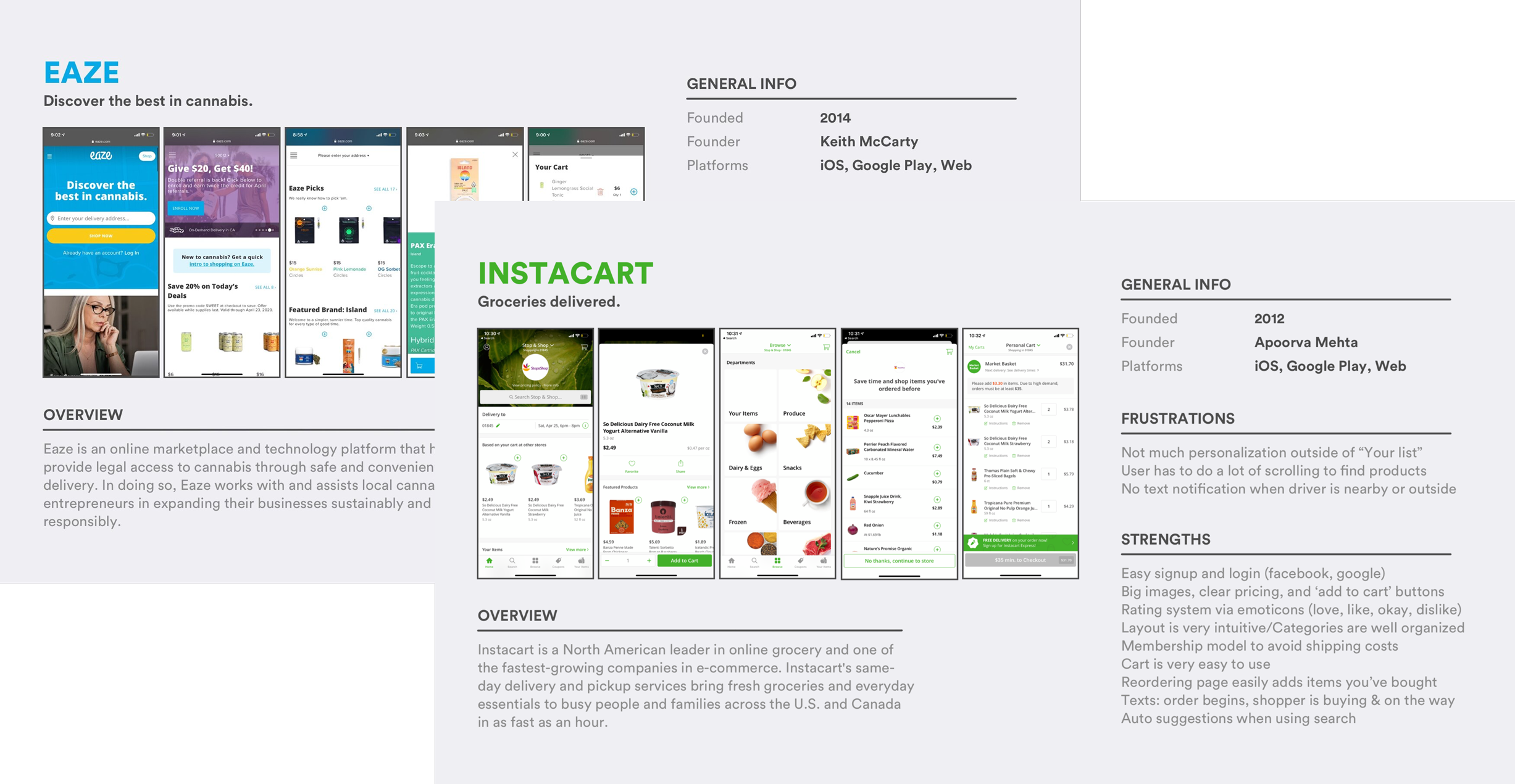
As a starting point, we each did some market research on competitors to investigate the current offerings in the market and take inspiration from features that we liked about each app.
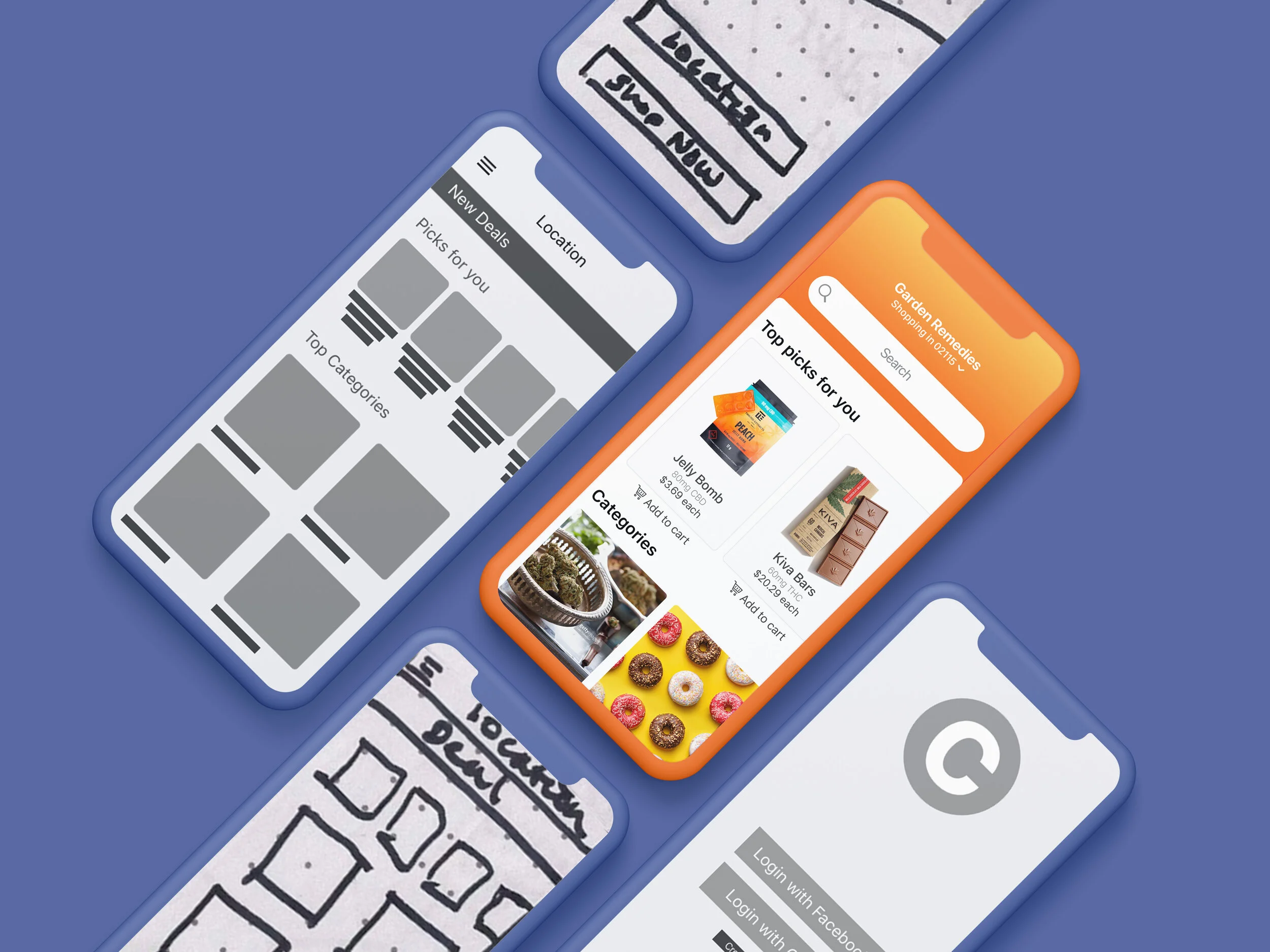
After studying the market we conducted 15-minute sketching sessions to encourage each team member to draw out their initial concepts and visions.
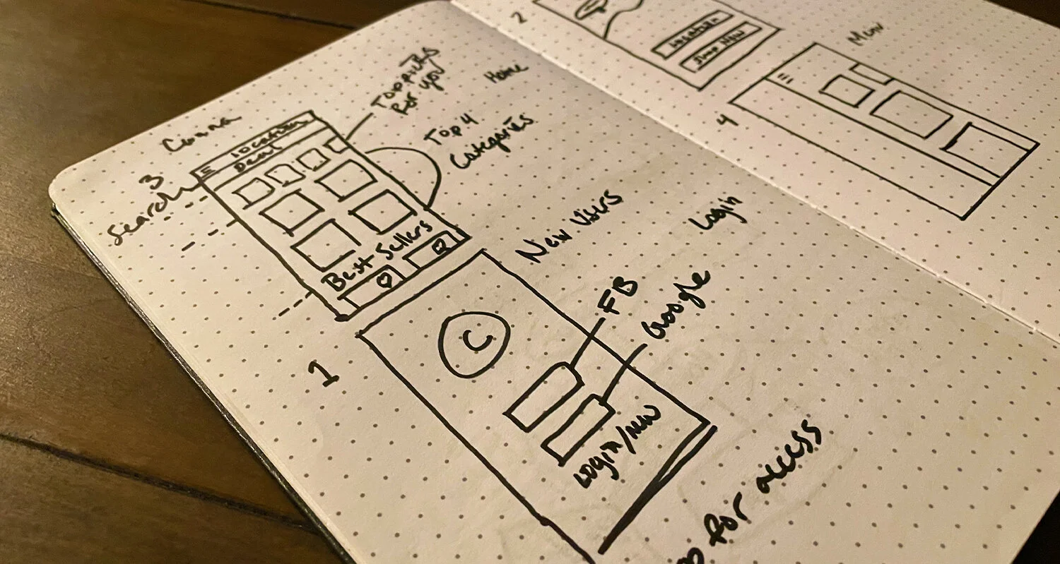
Defining the MVP
Through our sketching sessions, it was revealed that there were commonalities in the product vision. We identified three key user stories:
I want to view products and menus to compare, learn, and understand what I'm consuming. I want to know where it’s from and what’s in it.
I want to personalize my experience so I can get recommendations and discover products that serve my specific needs. (i.e medical vs rec, edibles vs plant,)
I need to ensure my consumption is private to avoid social stigma.
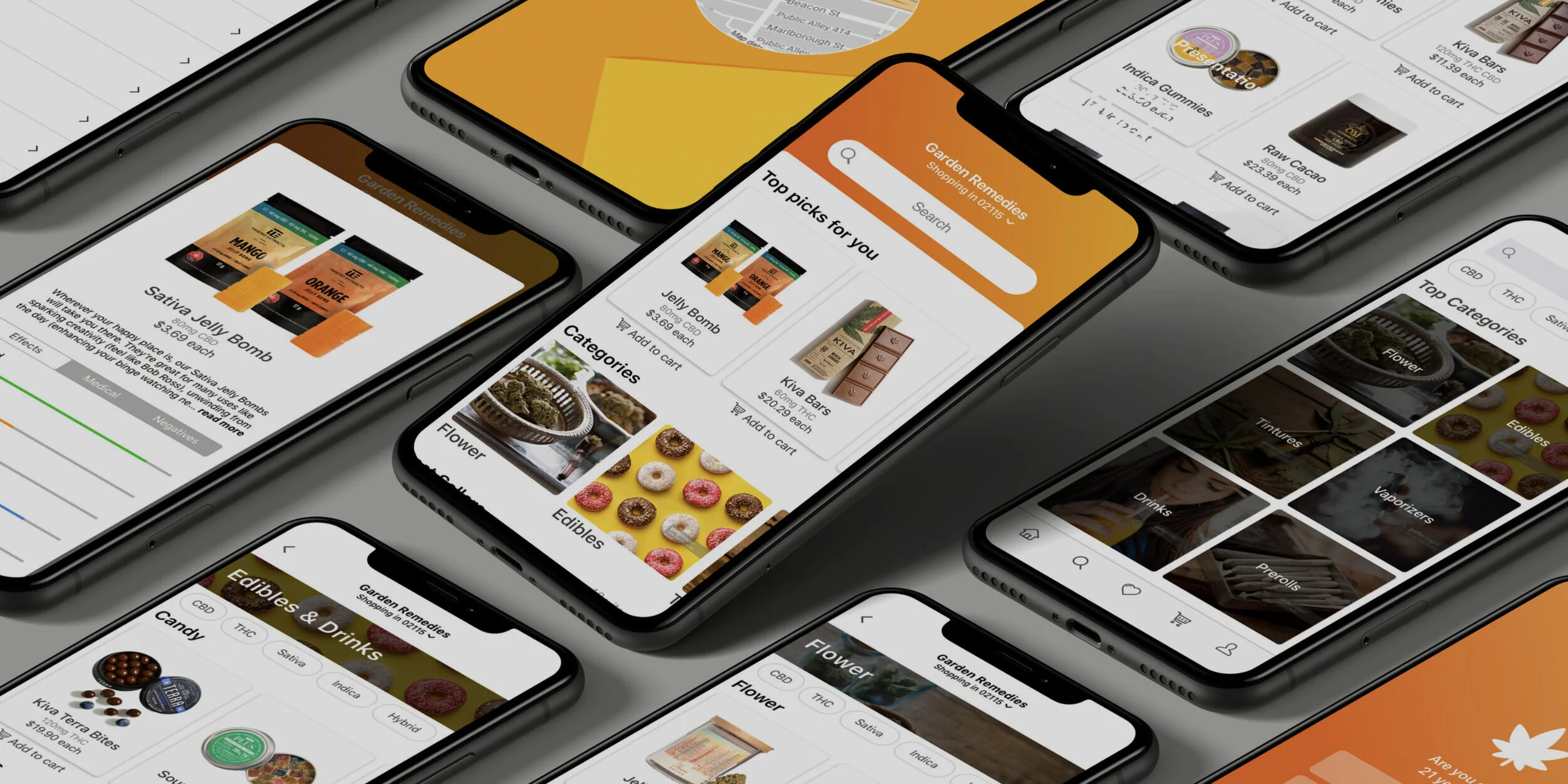
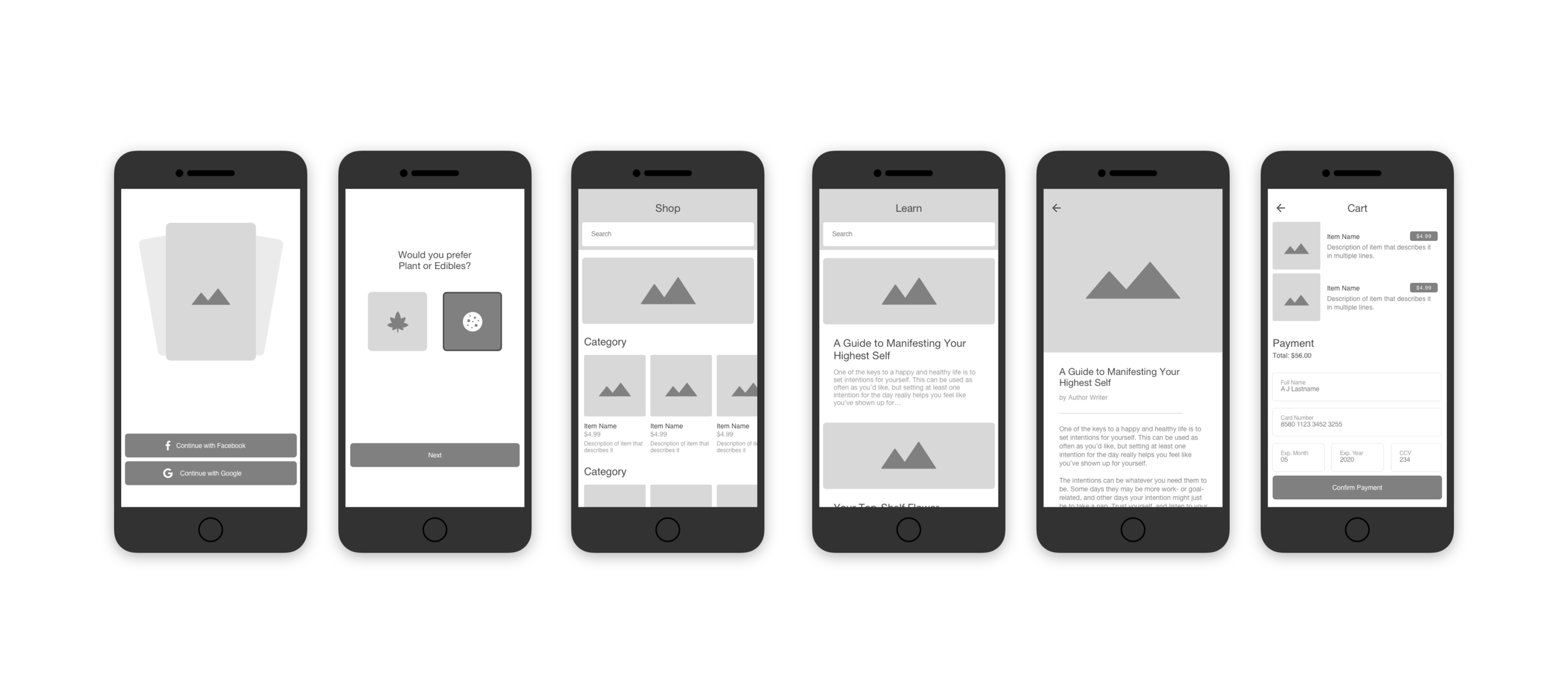
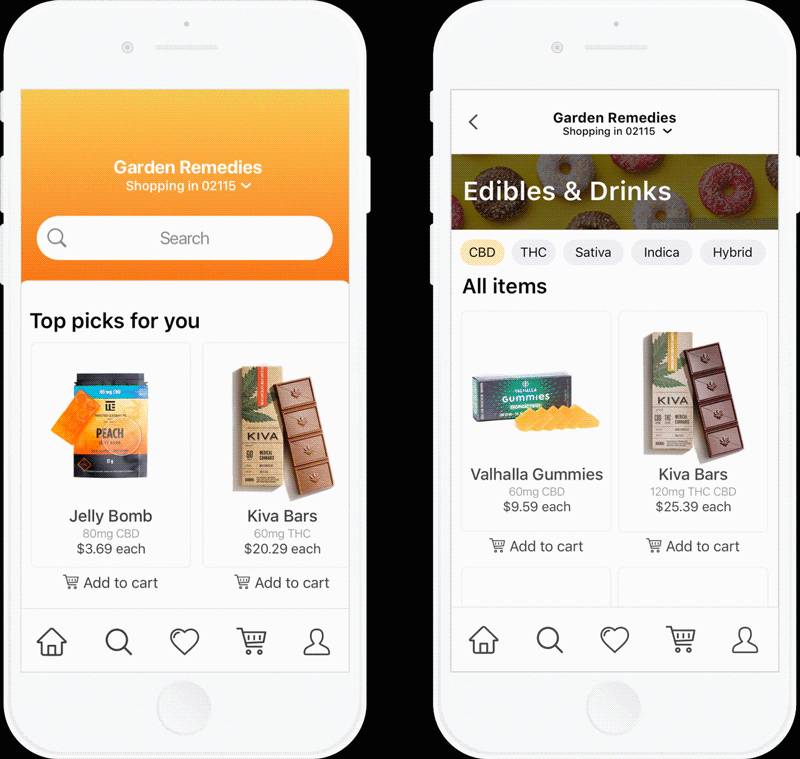
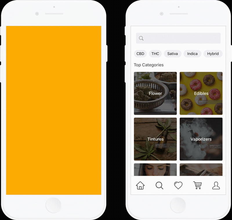
I mocked up the main screens based on the team’s sketches:
Login/Signup
Personalize
Shop
Learn
Article
Payment
Hi-fi Prototyping
I designed mockups of the basic user journey before going over them with high-fidelity styling. I opted for a refreshing gradient look and a contemporary design for the UI. Then we created a clickable prototype in Invision.
Results and takeaways
The marijuana industry is booming. Although there is still a social stigma around the legalization of usage, more states continue to decriminalize it in the US. Politics aside, it is out from the underground and a rising class of professionals is pushing the movement forward.
Our final usability tests showed us we were on the right track. We were addressing our user’s main motivations and frustrations.
Key takeaways from this project:
The best designs come from collaboration. It was great to see how each person brought a different perspective throughout the project. I noticed that non-technical people are unlimited with ideas and technical people are grounded in how those ideas are built.
Transparency matters. It's imperative that user experiences promote the benefits of products honestly and authentically. Putting the user first is vital to building trust, standing out, and winning long-term.
Design thinking is key to effective products. The goal is to improve products by analyzing and drawing insight from how users interact with them. Design Thinking offers us a means of digging deeper to uncover ways of improving experiences.